Folks, it's finally [nearly] finished! We're still awaiting the delivery of our rug, a side table for the leather chair, and a few accessories for the built-ins, but the big part of the design is finished and I couldn't bear to make y'all wait any more.
(Again, here I go thinking that y'all are checking in a hundred times a day to see if I've posted new pictures, when in reality, you may not have thought another thing about my little project since I posted this announcing it's inception.) I'll just continue to think what I like! :)
So, we did have a bit of a mishap with the color matching of our first paint swatch and ended up painting our walls highlighter green (not a good look)! But, after a second visit to the paint store, we just chose one of their formulas called "Happy Camper" and that is what we were!
First, allow me to remind you of the "Before":
And, without further ado, here is an actual photo of that wall in our bonus room you've seen over and over again.
The "After":
You'll have to imagine the new rug (the color will be very similar to the crewel pillow on the rocking chair) and a little metal side table under the lamp next to the leather chair. But, other than that, this is it!
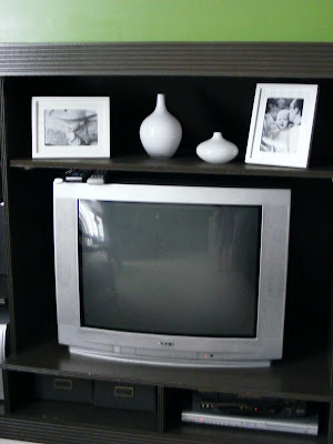
 Here's a shot of a small portion of the built-ins which were once white. Ryan added this extra shelf above the television so that there wasn't so much wasted space. Changing the color from white to dark brown had made all the difference in making it feel more like a piece of furniture in the room (which doesn't happen to monopolize a ton of floor space!).

Ry & I also decided that for artwork, instead of hanging photos on the walls, we'd incorporate a few cool things that we really love.
I got to choose on of my favorite interior design pieces (the Hill House chair, designed by architect Charles Rennie Mackintosh - love him!) and Ry created a silhouette of the chair and printed it on craft paper. (See the first picture in this post to see the chair.)
Ryan chose a type-face he likes and had an alphabet printed in that font on craft paper as well.


And, here are a few pictures of Ryan's office. Man, I wish Blogger would portray the colors more accurately!

When we changed the calendar from February to March we go to see what black on white looks like with the green too.
Many of you guessed correctly that the ceiling light we hung in Ry's office area is from Ikea. Great eyes!
I'm realizing that after posting all of these photos I don't really have one of the new sofa. I can't possibly bring myself to go upstairs right now and photograph it, so you'll have to wait until the rug comes, I guess.
Thanks to all of you for your input and suggestions. It really was a lot of fun to hear what you all had to say and y'all really did play a big part in us choosing to go with green. We're really please and we hope that you like it too!
Hopefully we'll have the honor of hosting many of you in our new room soon!

 Here's a shot of a small portion of the built-ins which were once white. Ryan added this extra shelf above the television so that there wasn't so much wasted space. Changing the color from white to dark brown had made all the difference in making it feel more like a piece of furniture in the room (which doesn't happen to monopolize a ton of floor space!).


11 comments:
I LOVE IT.
SO MUCH.
And yes, I was shouting just then. It looks fantastic. Next time I want to hire interior designers, I'll go to y'all first.
No, really, you guys did a great job. I can't wait to see the rug and such.
love it!
love the portraits on the shelf in the white frames - I am forever stuck on black frames but the white looks perfect & the vase set is again perfect. you two have great eyes!
I will say you and your pottery barn swatches inspired me to finally paint our bedroom - we are using shades of spring and then concord ivory for the master bath.
I really like Ryan's alphabet print. I also love the yellow crewel pillow.
wow I got wordy :P
Everything looks great Rae! I love the color. Our bonus room is looking a bit drab, maybe you could help us find something a little cheerier (is that a word?) Can't wait to see it in person. Hope you have a great week.
I totally love it! Makes me wish I had an extra room in my house I could paint this yummy green. Oh well maybe in my next house...
Great job!
I love it! It looks beautifuL!
Wow! What a transformation. It really is fantastic. A bit surprised that the alphabet graphic (which I love) is not Helvetica, though! The CR Mac Chair image is a brilliant touch. Y'all are going to love living and working in this room.
Well, we figured since the Lord's Font was already represented strongly in the office, we might want to go with something a little more 'home-y' in the family area.
Great room! BTW, what font is that on the alphabet print?
wow.. i feel like im looking at our den and our kitchen all in one..a blend of both! :)
that's the exact black/white chair that we have, and the exact yellow pattern that we have on a chair in our den too.. and the green and black looks just like our kitchen.
obviously i like it.. it looks very much like our house! :)
This is my first visit to your blog. I popped over from MckMama.
Your new room looks very cozy and spring-like. The window really adds a lot of punch to the room.
I LOVE IT, I LOVE IT, I LOVE IT! (to be said like my favorite Molly Shanon character Hellen Maden on SNL, while kicking your leg up high in the air)
Post a Comment